[FREE] fx:macro Lite / 22.10.23
Hi there! It's already Sunday, so it's time for another edition of fx:macro Lite! Great to have you here!
Below you’ll find a brief overview of how I look at sector rotation as one input in an overall macro picture. This is what MidJourney thinks the business cycle looks like in watercolours. I had to fish out all the images with bicycles but the result is pretty amazing.
 |
In case you missed the usual deep-dive yesterday, you can still sign up for that here and get access to the premium content:
💎 ECB Prep for next week
We have two central bank meetings coming up this week: the BOC and the ECB. If you're trading a central bank meeting, the preparation for that should always include recapping the last rate statement and minutes, looking at the economic data that was released since then as well as the comments from decision-makers.
Here’s the prep for the ECB meeting, I’ll include the one for the FOMC next weekend:
https://drive.google.com/file/d/1E5unX6q_tJaDeaPLZyl3k-FhuHPx5gGn/view?usp=share_link
Let me give a quick shout-out to one of my favourite newsletters, Snippet Finance. They curate the most interesting snippets on finance and investing and deliver them in a short easy-to-digest form. Curated by an investor for investors. Check them out!
 |
💡 Business Cycle and Equity Sector Performance
I was recently asked why I’m looking at equity sectors as part of a macro overview, so I thought it would be a good idea to write a few words on that.
Here’s a nice chart from Fidelity that shows how different sectors perform during the four phases of the market cycle:
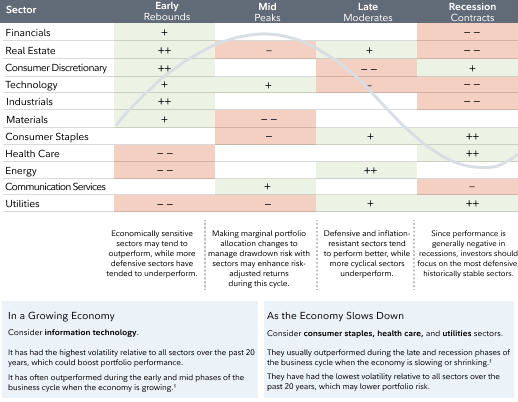 |
- After a recession, you want to be long Financials (because the yield curve steepens and demand for credit increases), Consumer Discretionary and Industrials (because businesses and people start spending more).
- Late in the cycle, it’s Energy that outperforms, and
- During a recession, defensive sectors like Consumer Staples, Healthcare and Utilities are where portfolio managers can hide.
The whole thing also works in reverse: if we know what sectors are currently performing, it gives us an indication of what stage of the cycle we’re currently in. Or at least what stage the stock market is currently in. Other assets might do their own thing.
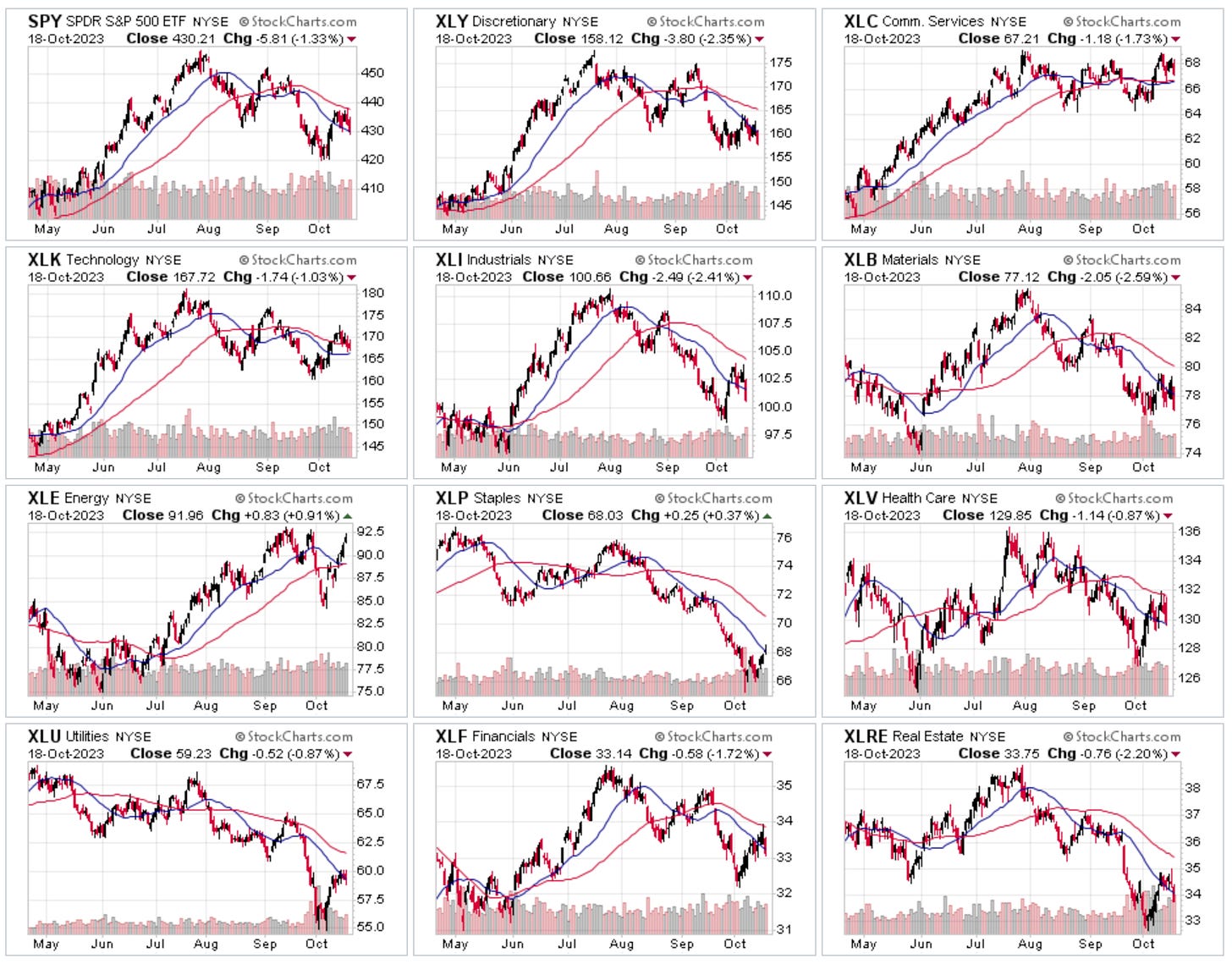
There are countless websites showing the performance of stock market sectors in various different ways. If you’ve followed me for a while, you know I like to look at the charts from Finviz and stockcharts.com. I also like checking out the thumbnail charts because they are a bit more fun:
 |
Another way is to look at rotation graphs: they look at the performance of every sector relative to a benchmark and plot the strength along the x-axis and the momentum on the y-axis:
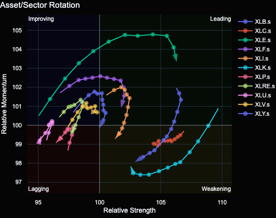 |
- Leading sectors are in the top right quadrant: they show both relative strength and momentum vs. the benchmark.
- Sectors in the bottom right still show relative strength but have lost momentum: they are weakening.
- The bottom left corner is where sectors end up when they have lost momentum and have become weaker than the benchmark: they are lagging.
- Finally, if sectors are picking up momentum from there, they move into the top left quadrant and are considered to be improving.
Movement generally happens in the clockwise direction. Since the rotation chart is calculated on a weekly basis, it offers a higher-level view.
Currently, Energy XLE and Financials XLF are the only sectors in the top right quadrant. The outperformance of Energy fits the idea that stocks are at the top or in the late stages of the cycle. Utilities XLU and Consumer Staples XLP are in the bottom left quadrant and seem to be stuck there, which probably isn’t where theory would put them. What about Tech? XLC and XLK are both in the bottom right, i.e. “Weakening”, along with Consumer Discretionary XLY. That makes sense when we believe in the idea of being in the late stages of the cycle.
One last thing I want to mention: just like the S&P 500, sectors can be dominated by a few stocks that are given outsized weights. Take XLY as an example where just two stocks make up 42% of the entire thing: Amazon and McDonald's. It makes sense to look at the ETF holdings (or index constituents) if you’re working with sectors to put their moves into perspective.
Check out this chart of XLY, AMZN and the ratio of the two since the bottom of the Covid low. It’s pretty clear that most of the performance of the ETF is driven by Amazon… in good times as in bad times:
🧠 Tweet of the week…
To be honest, when I saw this the first time, it didn’t have the context debunking it attached, and I believed it. Sorry Australians 😂
Looks like we’re perfectly on point:
 |
Until next weekend!
fx:macro
Join 5,000+ readers and sign up for the free newsletter!
Hi there! It's already Sunday, so it's time for… an announcement! TL;DR: This is going to be the last newsletter for a while. You don't need to do anything, I'll probably be back but I don't know when, and I will neither sell your email address nor send you spam in the meantime. I've been writing fx:macro for about 20 months now, and it has grown into something I'm proud of. As I've often said: it helped me in a lot of ways to become more structured and more concise, I've met great people...
Hi there! It's already Sunday, so it's time for another edition of fx:macro Lite! Great to have you here! This week's image shows a cesspool with a gold nugget in it. Which has a lot to do with the last bit of homework I do every day. Read more about that below… Let's get started… In case you missed the usual deep-dive yesterday, you can still sign up for that here and get access to the premium content: 💎 Central Bank Speaker Recap for this week Speaking of homework… here's this week's...
FX:MACRO - Week 49/2023
Welcome to issue #84 of fx:macro! Summary Research folder with all material: Google Drive The archive will all previous issues can be found here: https://fxmacro.ck.page/ Playbook for next week This is the shortest possible summary of everything you will find in the rest of this newsletter. Please check out this article about what this summary aims to provide and what its limitations are. Currency Drivers For an explanation check out this link. Week in Review Central bank speaker recap for...